Special thanks to Roberto Jourdain, Kaggle/Google, and Boston Athletic Association (BAA) for supplying and hosting the detailed results. And to Weather Underground for the historical weather information.
Dynamic charts using High Charts. Advanced Analytics using Python, NumPy, Pandas, and Seaborn libraries. Additional help by Claire Pang, USF Data Science.
49℉ to 75℉
9 to 26 mph
23% to 78%
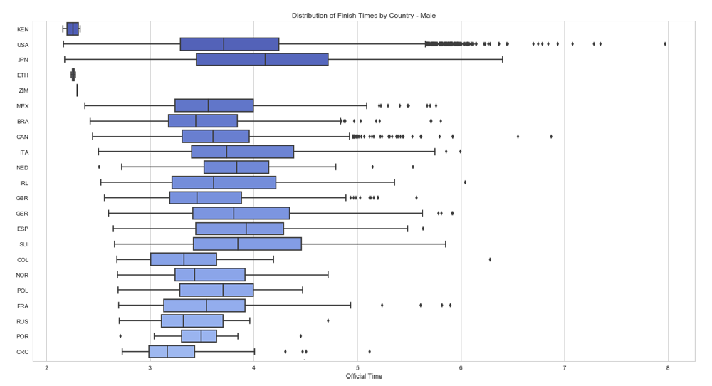
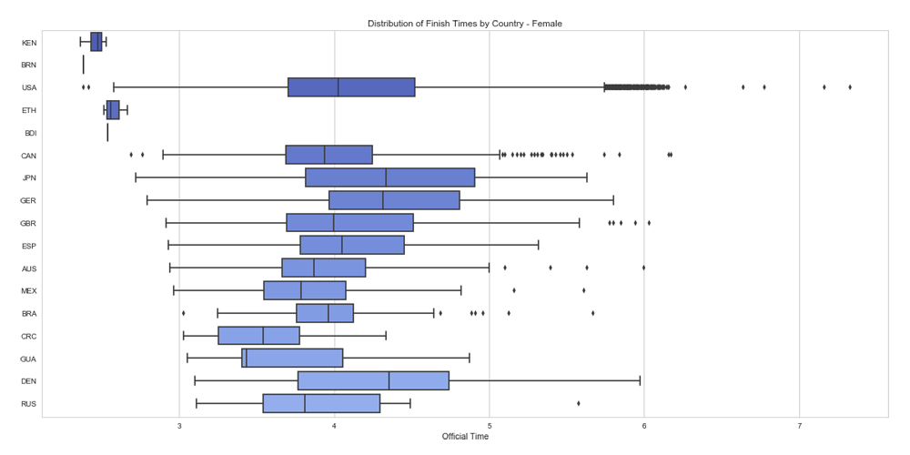
Box Plot of the top finishes from the top dozen or so countries. Notice the tight finishing by the group of Ethopian and Kenyan runners for both males and females.
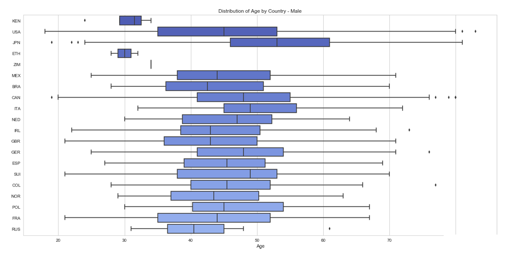
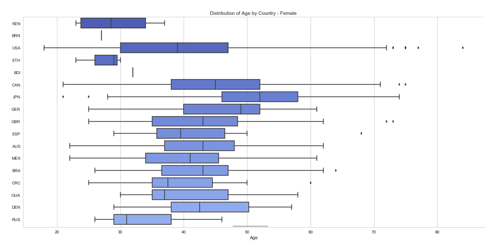
Box Plot of the ages from the top dozen or so countries. Notice the tight and young age group of Ethopian and Kenyan runners for both males and females.
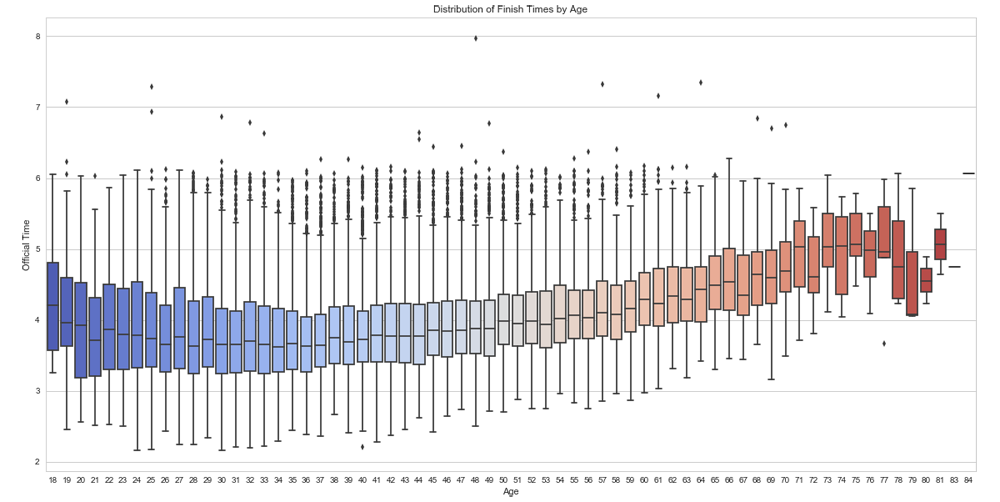
Box Plot variation of Finish Times by Age (combined gender). Notice the similar curve from young to old for both average versus elite runners.
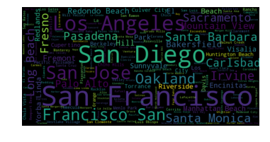
For a few of the larger State entries (Massachusetts, California, New York, Texas) with over 1,000 finishers, a quick look at which Cities some of the USA runners are from.